Code Snippets How to Add WordPress Pages Category and Tags, That Supports Full Site Editing May 12, 2025
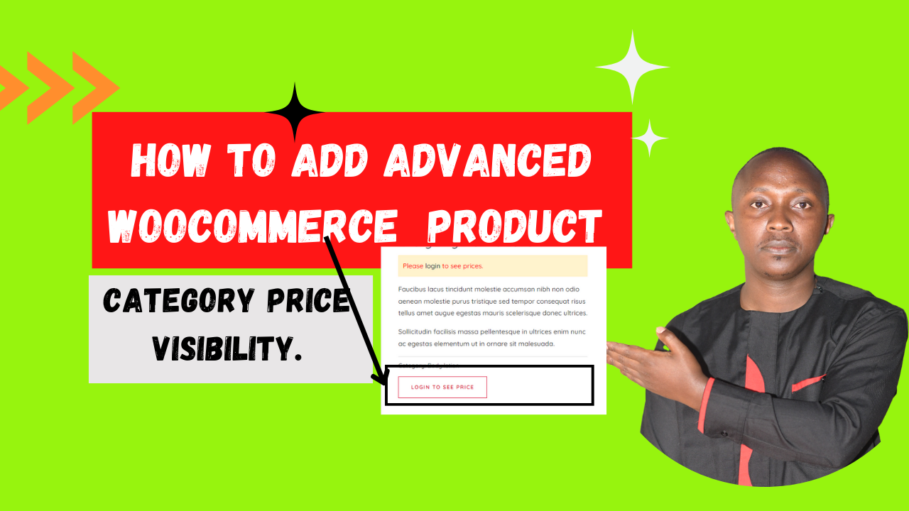
Code Snippets How to Enhance WooCommerce Product Category Price Visibility Using Code Snippets: A Comprehensive Implementation Guide FREE, No PLUGIN. October 29, 2024
